Design Tips for Eye-Catching Fitness Class Posters
Well-designed posters are essential for fitness studios. They help engage members, increase attendance, and promote a professional look. With these design tips for eye-catching fitness class posters, you can easily create posters that stand out and inspire participation. Below, we’ll walk through simple steps to design posters that are readable, attractive, and impactful. From choosing the right fonts to selecting colors and printing, these tips will ensure your posters make a strong impression.
1. Choose Bold, Readable Fonts for Fitness Class Posters
When designing eye-catching fitness class posters, font choice is essential. Use bold, easy-to-read fonts that can be seen from a distance. Simple, sans-serif fonts like Arial or Helvetica work well because they are modern and clear. For maximum impact, make essential details—such as the class name and time—the largest text on the poster.
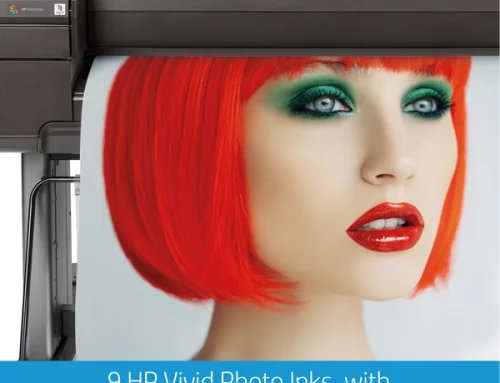
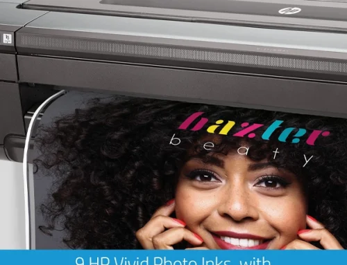
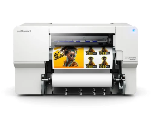
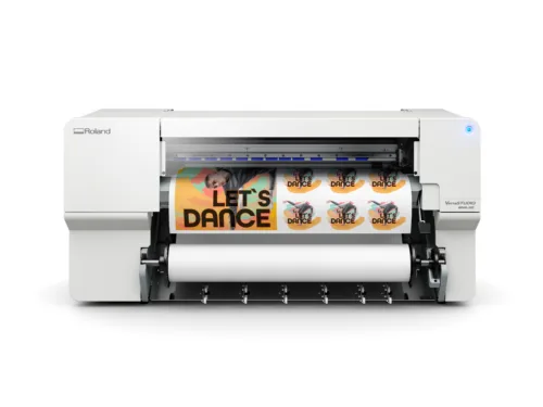
Limiting the design to one or two font styles will keep it clean and cohesive. You can add contrast by varying font weights (bold or regular) within the same font family, creating hierarchy without overwhelming the viewer. For professional-looking prints, consider using a poster printer machine for top-quality results.
2. Use High-Quality Images to Capture Attention
Incorporating high-quality, relevant images is crucial for eye-catching fitness class posters. Choose photos that reflect the style of each class, such as peaceful yoga images for relaxation classes or dynamic action shots for cardio sessions. Real photos of your instructors or studio add authenticity and help members connect with the content.
When using images as backgrounds, add a subtle overlay to keep the text readable. This small adjustment keeps your poster balanced and appealing while ensuring the essential details are clear.
3. Use Colors That Stand Out and Align with Your Brand
Color is an important factor in creating eye-catching fitness class posters. Using your studio’s brand colors adds consistency across all materials, while accent colors can highlight key details like class times or instructor names. High contrast between text and background is also essential—it makes the poster easier to read and more likely to catch the eye.
For example, bright colors like yellow or teal can help emphasize important information, while avoiding color combinations like red on green will prevent strain on the eyes. With well-chosen colors, your posters will look professional and attractive.
4. Organize Information with a Simple Layout
A simple, well-organized layout is key to eye-catching fitness class posters that quickly communicate information. Structure your poster with a clear hierarchy: start with the class name as a bold headline, followed by instructor names and class times in a smaller font, and add any additional details last.
Keeping white space around text and images prevents clutter and focuses attention on important information. A clean, organized layout makes it easy for members to find what they need at a glance.
5. Add a Call to Action for Immediate Engagement
Adding a call-to-action (CTA) encourages members to take immediate action. Phrases like “Join Today!” or “Reserve Your Spot” can prompt members to get involved on the spot. A QR code that links directly to your studio’s booking page is also helpful, providing quick access to more details.
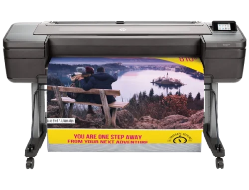
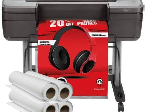
Including a CTA boosts the effectiveness of your posters, making them not just informative but also motivating. For studios that need frequent updates, having a poster printer machine in-house ensures flexibility and speed in printing new designs.
6. Print Posters on High-Quality Paper for a Professional Look
To achieve a professional look, print your eye-catching fitness class posters on glossy or semi-gloss paper. Glossy finishes make colors pop, adding vibrancy and polish to the design. A poster printer machine lets you print high-quality posters in-house, saving time and ensuring consistent quality.
With the ability to print on-demand, studios can keep their materials current and professional. Common poster sizes like 18×24 or 24×36 inches work well in fitness settings, providing clear, readable content without taking up too much space.
7. Position Posters in High-Visibility Areas
Placement is just as important as design when it comes to eye-catching fitness class posters. Place posters in high-traffic areas such as the front desk, locker rooms, and near the entrances to popular class areas. Rotate posters regularly to keep the display fresh and highlight different classes or events.
With strategic placement, your posters will reach the maximum number of members, ensuring they capture attention and promote engagement.
Wrap-Up: Use These Design Tips for Eye-Catching Fitness Class Posters
By following these design tips for eye-catching fitness class posters, you can create visually appealing, informative, and engaging posters that boost attendance and enhance your studio’s brand. Each detail, from font choice to color and layout, plays a role in creating an effective poster. For quick, high-quality printing, a reliable poster printer machine can make it easy to produce consistent, professional posters whenever needed.
Apply these design tips today to create fitness class posters that inspire and engage your members. For more information or questions, feel free to contact us. Thoughtful design and strategic placement will help turn your posters into powerful tools for building community and motivating members toward their fitness goals!
About the author : Kerri Moran